Typesetting Guidelines
- Intro
- Typeface Style Guide
- Margins, Alignment, and Positioning
- Line Breaking and CPS
- Double Border
- Tips and Shortcuts
- Typesetting Examples
- Additional Typesetting References
Intro
You should generally use the Style Editor when editing the subtitles.
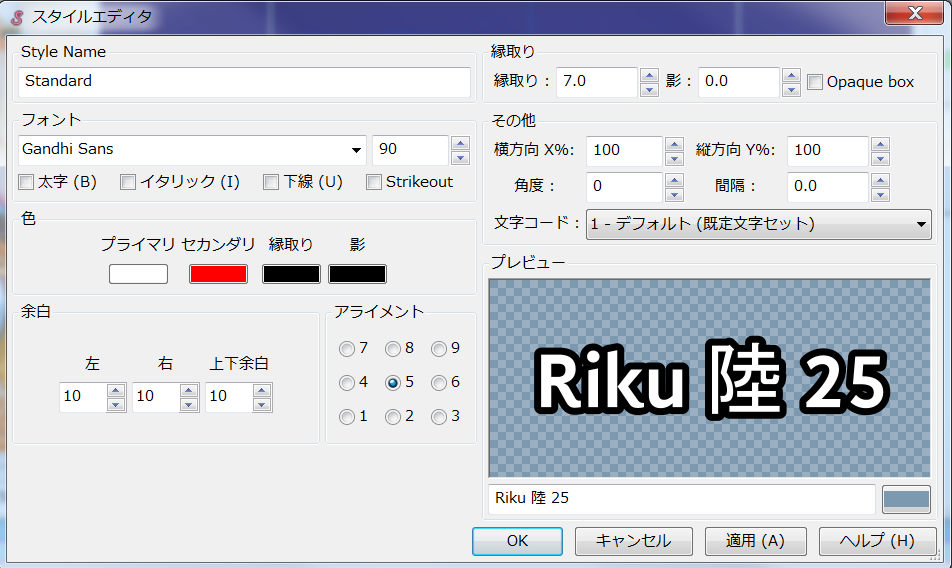
This can be accessed by clicking on the S icon in the toolbar or by clicking Edit next to the style dropdown.
Typeface Style Guide
These are the preferred settings for subtitle typefacing.
This is in the situation of a 1080p video.
HLR Standards
These are guidelines to be followed by HoloResort Translations subbers.
Font Family | Noto Sans Japanese (Noto Sans JP)
|
Font Size | 100-120 (Standard is 110)
|
Border or Outline Size | 7-8 (Standard is 7.5) |
Border or Outline Color |
|
Shadow | 0-1 (Standard is 0.5)
|
General Standards
For general and basic typesetting advice, we recommend lyger's Subtitling Guide.
These are all-purpose guidelines we recommend for all subbers.
Font
- It should be easily distinguishable.
- It should be moderately thick.
- There are no unnecessary shapes to the characters.
Font Size
- The cap height should cover around 8% of the screen.
- ~80 pixels on a 1080p video.
- Too small and it can’t be read on mobile vertical; Too big and it’ll steal most of the attention.
Border Size
- ~⅓ of the font’s thickness.
- Eyeball it until it feels right.
- Find the right balance for your font.
Border Color
- VTuber Color Reference.
- It should be easily distinguishable who’s who. Especially in a collab.
Shadow
- Personally, using it other than indenting text is just a waste.
- I won’t go past 3
- Might use it for ShadTrick instead.
Note to HLR Docs Editors:
- Link to ShadTrick
Margins, Alignment, and Positioning
It's not just about how each of the letters and lines look, but a major part of how subtitles can look good and be readable is how the subtitles are framed within the video. Specifically, the margins, alignment, and positioning of the subtitles.
For general and basic typesetting advice, we recommend lyger's Subtitling Guide.
Margins
The Left and Right margin should at least be 60 (Standard is 150)
- It shouldn’t be anywhere near the edge of the screen.
- It should always be near the center.
Vertical margin should at least be 80 (Standard is 100).
The position of the subtitles should NOT be touching the YouTube player bar.
It shouldn’t be able to cover more than the chin of the talent.
Alignment
an2for general subtitles.an5for tag manipulation and animations.- an7 for drawings.
Positions
The positions are dependent on what you are subbing.
- If the video is a Free Talk or Story Telling, it should be centralized on either the center of the screen or where the talent is.
- If the video is a game-play, it should be centralized on the gameplay and avoiding GUIs and Menus.
- The consensus is it should be over where the audience will be looking.
These are common examples of where subtitles should go.
Collabs
Define their positions. If one goes on top of the other, that one should always be on top and vice versa.
If there is a line break, put the top’s position to the one below.
- If the top speaks earlier and has a line break but the bottom also speaks later on, keep the top’s original position.
Line Breaking and CPS
Note: This section is partially based on the BBC Subtitle Guidelines.
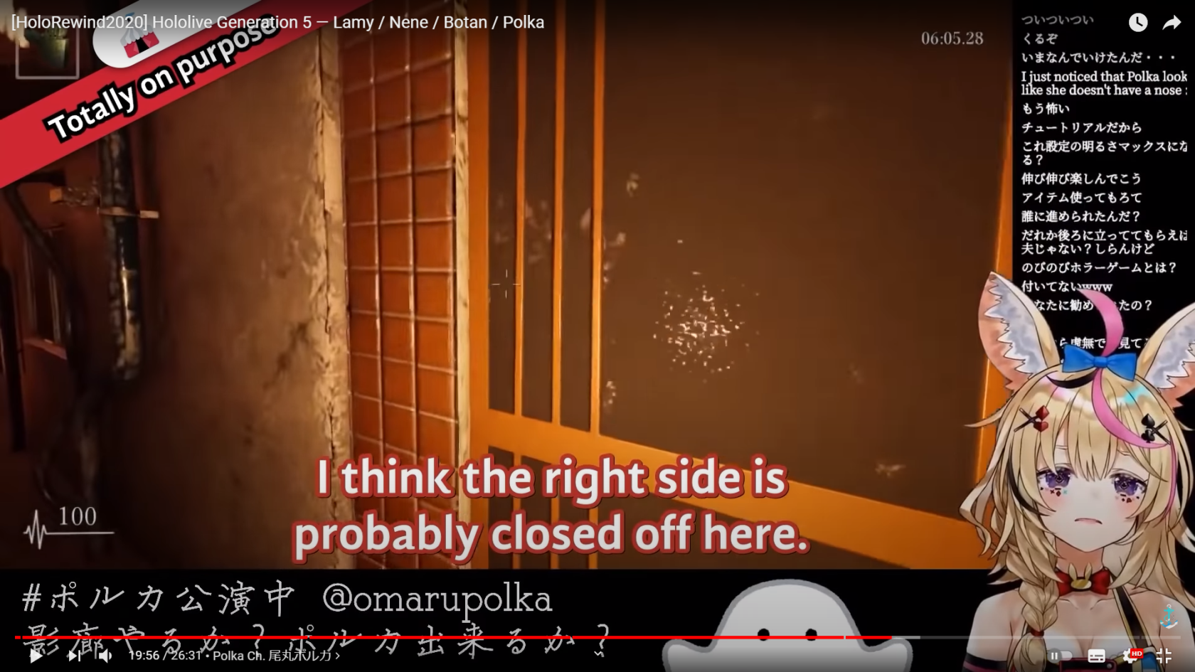
CPS (Characters Per Second)
CPS measures the number of characters, including spaces and punctuation, that appear in subtitles per second.
- Amara
Characters per second is the scale of how readable text is in conjunction with reading speed. It determines whether or not there is enough time to read a certain subtitle line comfortably and without trouble. The simple objective is: low-ish CPS good, high CPS bad.
|
|
|


The CPS column in Aegisub scales from white to red depending on how high it is. Red CPS signifies that it is already dangerously high.
- Always keep it below 20. If it’s higher than that, you should contact your PRs to reword the sentence.
- If your CPS is less than 5, this means the line has a lot of space to work with and you can split and break it down.
- 20 (absolute max 25) if it's a long line (like more than 3 words)
- 15 (absolute max 20) if it's a short line (like 3 words or less)
- Theoretical maximum CPS is 25 and this is for Book Readers.
Line breaking (\N or Shift + Enter)
- An ideal line break will be at a piece of punctuation like a full stop, comma, or dash.
- A line break should always be before a pronoun/name.
- Avoid splitting the following parts of speech:
- article and noun (e.g. the + table; a + book)
- preposition and following phrase (e.g. on + the table; in + a way; about + his life)
- conjunction and following phrase/clause (e.g. and + those books; but + I went there)
- pronoun and verb (e.g. he + is; they + will come; it + comes)
- parts of a complex verb (e.g. have + eaten; will + have + been + doing)
- Make sure the line break is justified. This means that the subtitles’ margins should relatively be weighed the same.
- There are some exceptions to this, such as when a word you’ll be line breaking is too long, you should prefer it to be bottom-heavy.
There should only be 1 line break.
No matter what, there should only be 2 lines stacked on top of each other. If a sentence is too long, break the sentence down and split it into multiple lines instead.
Collabs
If the video has multiple speakers, the maximum lines stacked that should appear is 3.
- If there are only 2 speakers, The one who is the main speaker of the conversation will get a line break while the other does not.
- If 3 speakers are speaking on top of each other, they each only get 1 line. No line breaks.
If there’s more than 3, good luck.
Double Border
- Installation of automation tools will be more detailed below.
- Double borders are used to give more visibility to the text for the viewer.
- It’s only used if:
- The border color is too light.
- If it’s yellow, always use Double Border.
- The margin of the subtitles already has text behind it.
- The margins of the subtitles are noisy and hard to see without it.
- The border color is too light.
This is the settings used for adding double border:
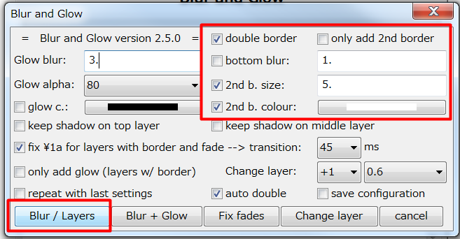
You can check “save configuration” to save this configuration.
Shadow Indention can be used as a substitute or in addition.
Tips and Shortcuts
You can save styles on your style manager to always have a preset whenever you are doing a new project. This can save time if you have all the default settings already made and just need to be readjusted accordingly.
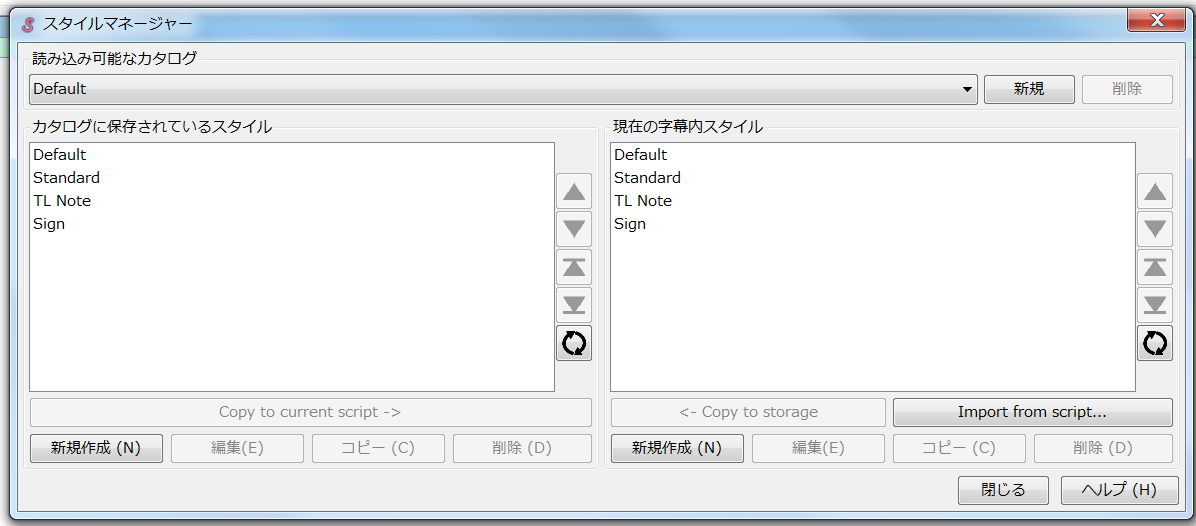
Having a standard that fits this guideline is advisable.
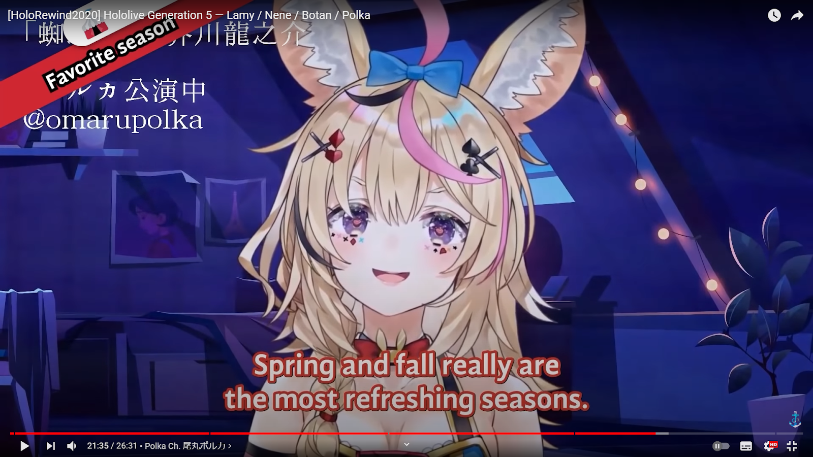
Typesetting Examples
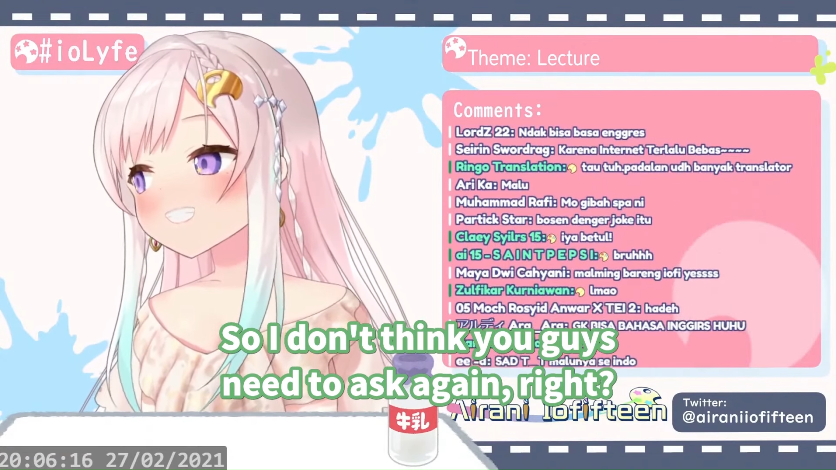
Standard subtitles under normal circumstances
Taken from Iofi has to scold her chat [Hololive Eng Sub | Airani Iofifteen]
Standard subtitles made to fit the game’s UI
Taken from Ollie tries to steal from Moona, fails [Hololive Eng Sub | Kureiji Ollie / Moona Hoshinova]
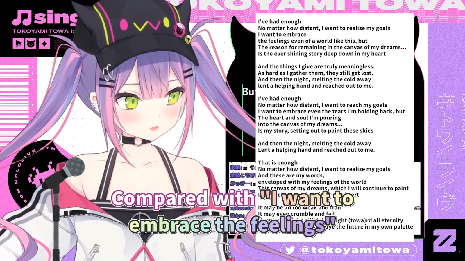
Standard subtitles with color and border modifications
Taken from Towa explains the meaning behind “Palette” [Hololive Eng Sub | Tokoyami Towa]
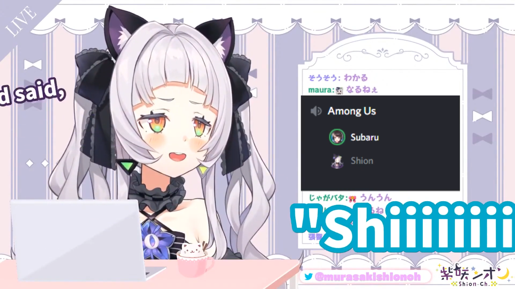
Standard subtitles with animation and size modifications
Taken from Subaru got stood up feat. Shion [Hololive Eng Sub | Murasaki Shion]
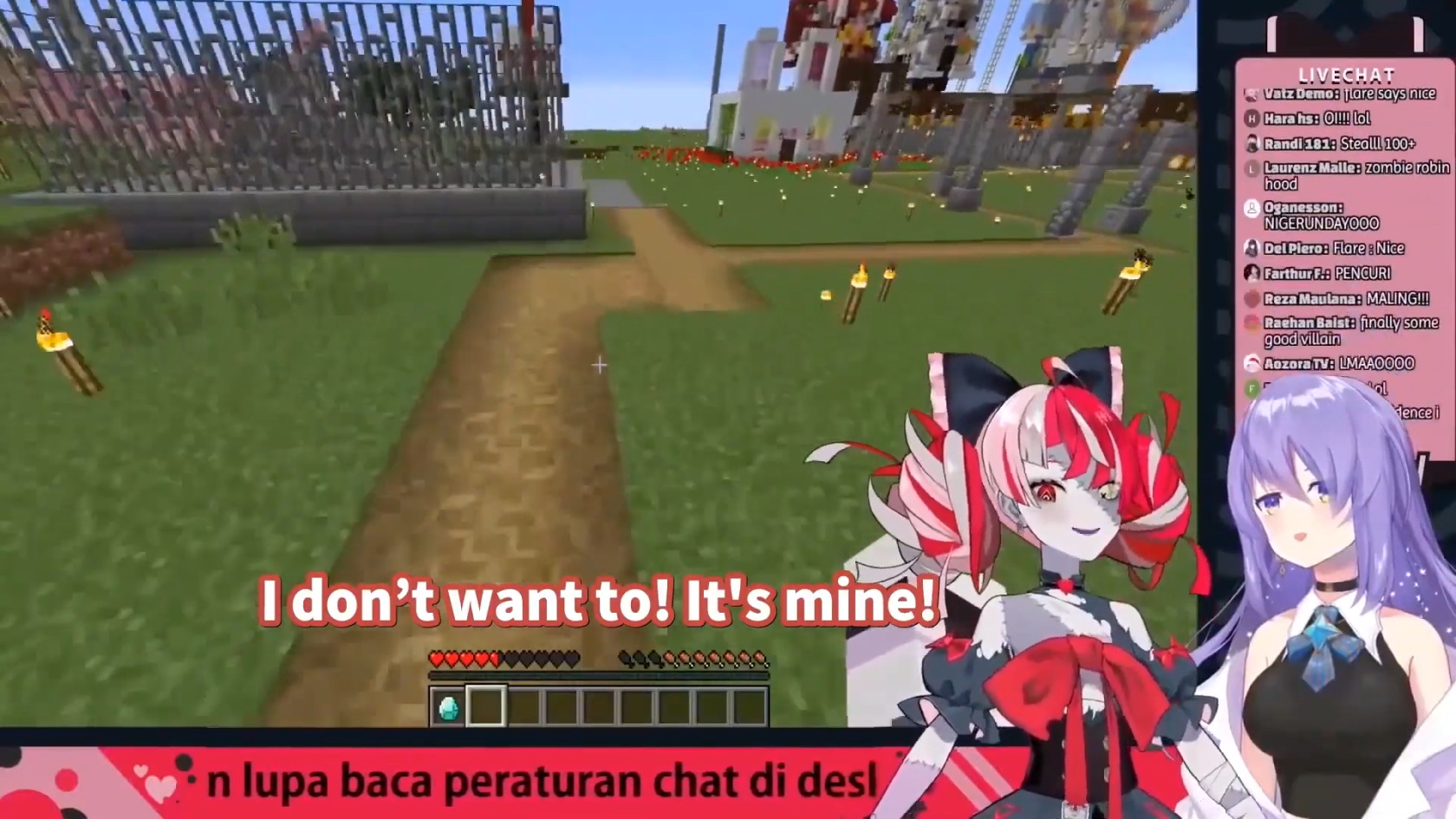
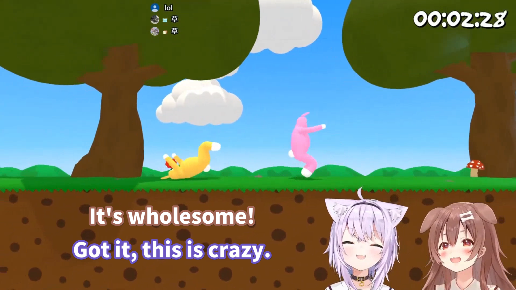
Standard subtitles with placement adjustments and multiple speakers
Taken from the HLR Subbing Test
Non-HLR sub implementing HLR guidelines with custom font / typeface
Taken from Selen fights Giganto in Sonic Frontiers
![Masao T - Selen fights Giganto in Sonic Frontiers [OnxkKWfcj5E - 1920x1080 - 0m06s].png](https://wiki.holoresorttls.org//uploads/images/gallery/2025-06/scaled-1680-/TjWfKc5Z0F0NrTBx-masao-t-selen-fights-giganto-in-sonic-frontiers-onxkkwfcj5e-1920x1080-0m06s.png)
Additional Typesetting References
Here are some additional resources you may find useful:
- Subtitling Guide by lyger
- BBC Subtitling Guidelines
- English Timed Text Style Guide by Netflix
- Typesetting in Aegisub by unanimated